My role
Lead ID, team of 3
The organization was replacing its HRIS, but the interface, workflows and requirements were still changing. I led the strategy, design and development of the learning experience that prepared employees for a successful launch.
A fully remote organization was replacing its entire employee system of record. All 412 employees and managers would be logging into an unfamiliar platform to complete essential tasks like viewing pay and benefits, requesting time off and navigating a whole new system.
The biggest shift wasn't the software. It was the behavior. For the first time, non-exempt employees would be required to clock in and out for every shift and meal break, introducing an entirely new daily routine.
There was no finished system to train on because the platform was still being built. Screens changed daily, requirements evolved and launch dates didn't move. We had two weeks to design, build and deliver training that would prepare the entire organization for day one.
The challenge wasn't building training for a new system. It was building confidence before the system was finished.
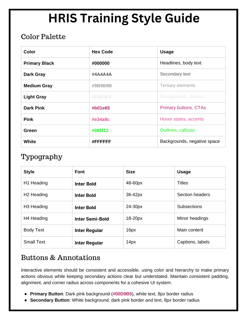
With two weeks and three designers, consistency wasn't a nice-to-have. It was the strategy. Before a single screen was built, I created the design system that would produce it. A master design guide established the visual language: typography, color palette, callout styles, annotation treatments, arrows and illustration standards. Three designers could work independently while producing one seamless experience.
I also divided the work by subject matter, pairing each designer with a dedicated SME across benefits, payroll, timesheets and HR information. Because the interface was still evolving, we built with placeholder screenshots and delayed every final screen capture until the platform was locked.
Then we tested the assumptions.
We ran a 50-person pilot that included managers and individual contributors, exempt and non-exempt employees. For one week, they used the new HRIS alongside the training, revealing exactly where the interface created friction and where the training needed to improve. The final course wasn't shaped by our assumptions. It was shaped by their behavior.
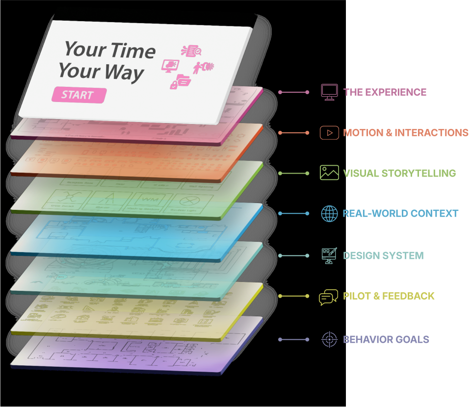
I built the course in Rise so three designers could build simultaneously in a shared project. Since HR content changes frequently, the training also needed to be easy to update, making long-term maintainability just as important as speed.
A highly customized Storyline build would have taken longer, limited collaboration and created a product that was difficult to maintain after launch.
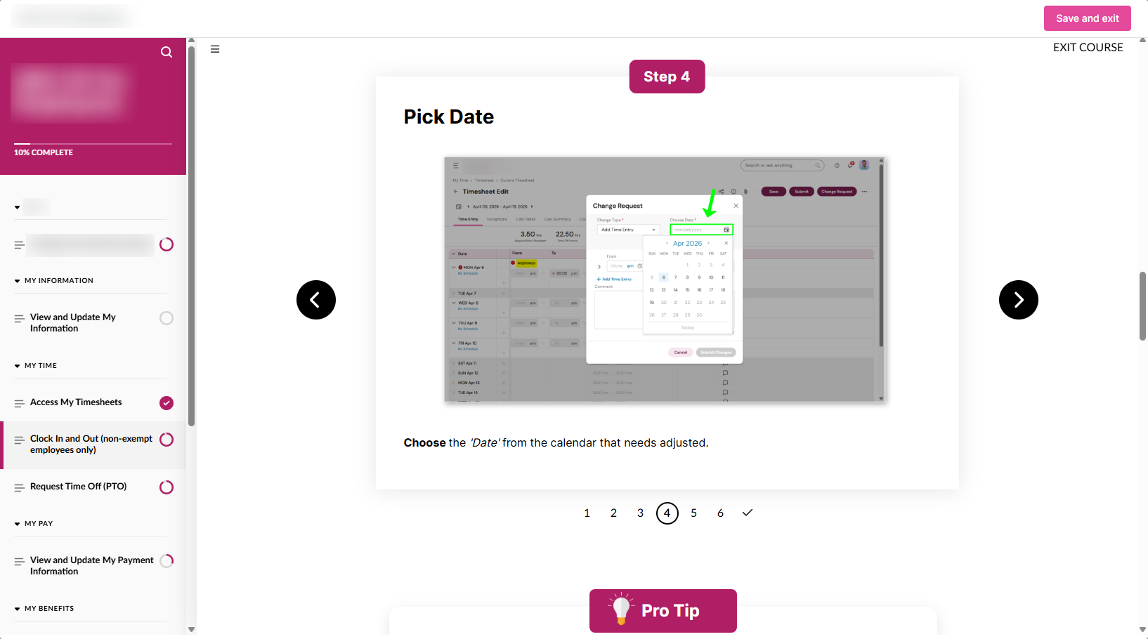
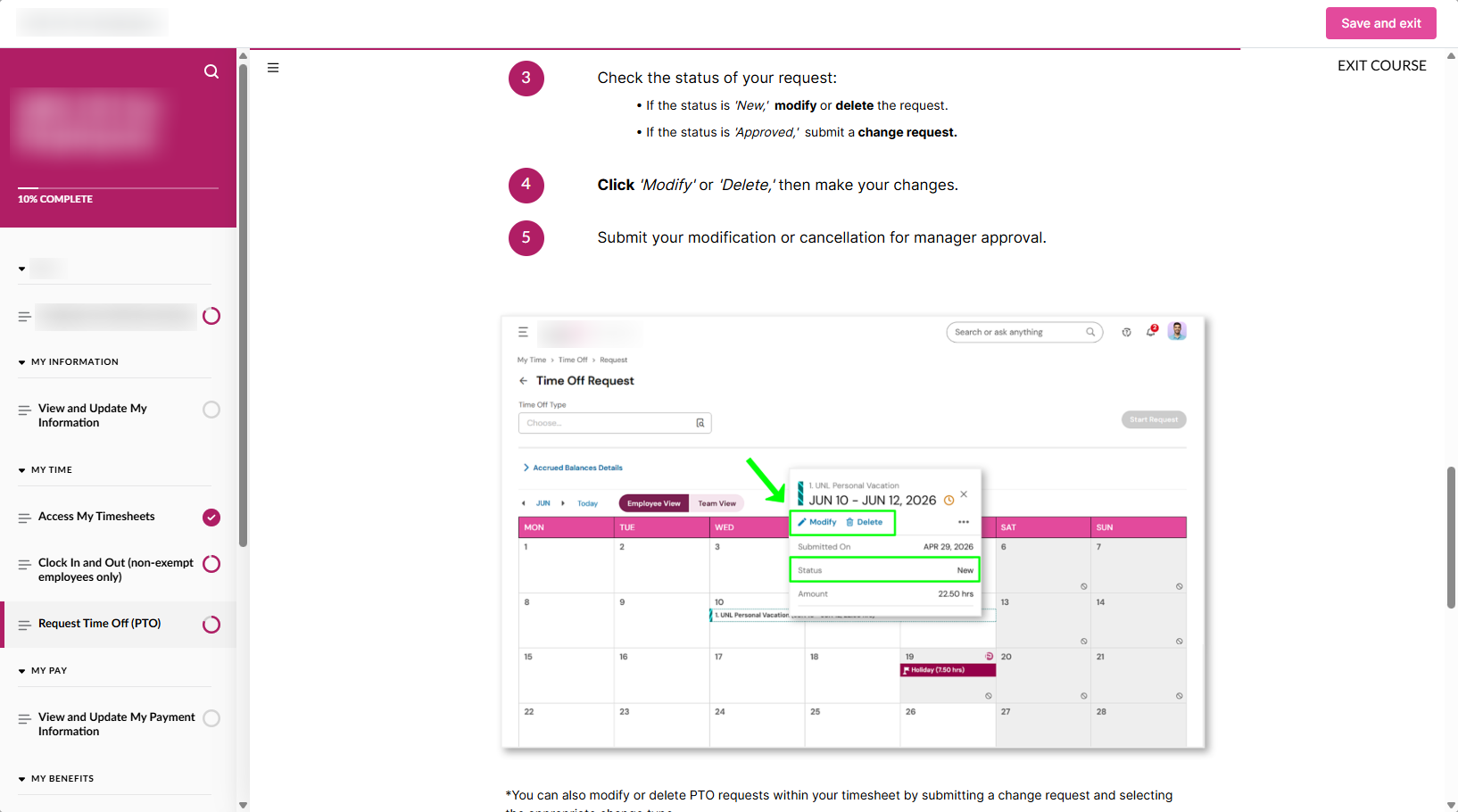
Every visual uses the actual interface. To capture them, we built three sandbox employees, a manager, an exempt employee and a non-exempt employee, each with custom avatars and realistic data. We captured every screen from the correct dashboard so learners would see exactly what they would encounter at first login.
Generic imagery would have recreated the same uncertainty the training was designed to eliminate.
Animated GIFs replaced static step lists wherever movement mattered, allowing learners to see exactly where to click and what to expect.
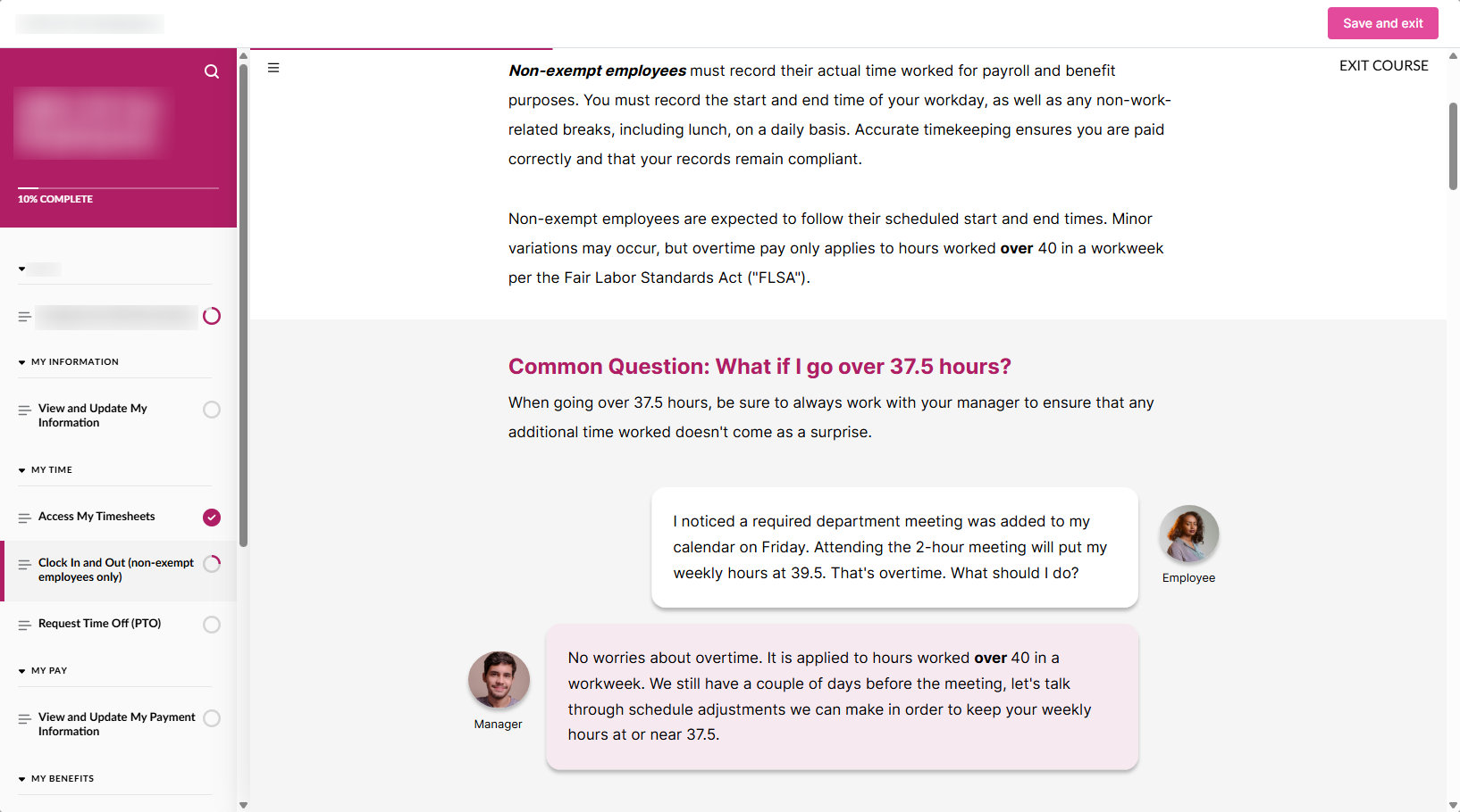
Along with a traditional FAQ, I turned the most common pilot questions into short scenarios staged as Teams conversations between coworkers, a format that matched the organization's fully remote culture.
We kept placeholder images in place until the interface was final. It meant some screens had to be captured again when the UI changed late in development, but it protected learners from training on a version of the system they would never actually use.
The design system governed every detail, allowing a three-person build to feel like one cohesive experience. Then the details did the teaching: live screenshots and GIFs with subtle drop shadows to create depth, custom callouts for tips and warnings, common questions transformed into Teams chat scenarios, mobile device frames for the app experience and two tailored learning paths, one for staff and one for managers.
A note on the numbers: these are early estimates from HR's support-ticket volume, not a controlled study, so I treat them as directional rather than definitive. A staff-wide survey at the two-month mark, in progress now, will turn this into cleaner, self-reported data on confidence and how independently people can now use the system.
Knowing how quickly we could build, I would have the final screenshot captures be the very last thing we did. We lost time retaking screens when the UI shifted late, and a more deliberate capture window would have reduced rework.
I would also centralize SME communication through a single project lead rather than pairing each designer directly with an SME. While the model worked, response times varied, and one point of contact would have reduced delays and kept decisions moving.
Neither changed the outcome, but both are the kind of process refinements that make the next build stronger.